
Which colours to choose for the bedroom? A complete guide
Colours in the bedroom act in a subtle but constant way: they influence the quality of sleep, the perception of room dimensions, and the way light is distributed throughout the day.
In this guide, we explore how colours interact with natural and artificial light, which shades promote sleep and which do not, and how to coordinate walls, furniture, and textiles to achieve a cohesive result.
How colour psychology guides our choices
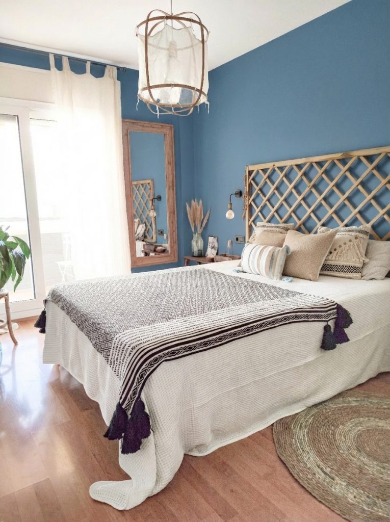
Research on colour psychology is fairly robust and can help us choose the right shades for bedroom walls and furniture. Blue, in its cooler and more desaturated variants, is the shade that most promotes relaxation and, therefore, a good night’s sleep.
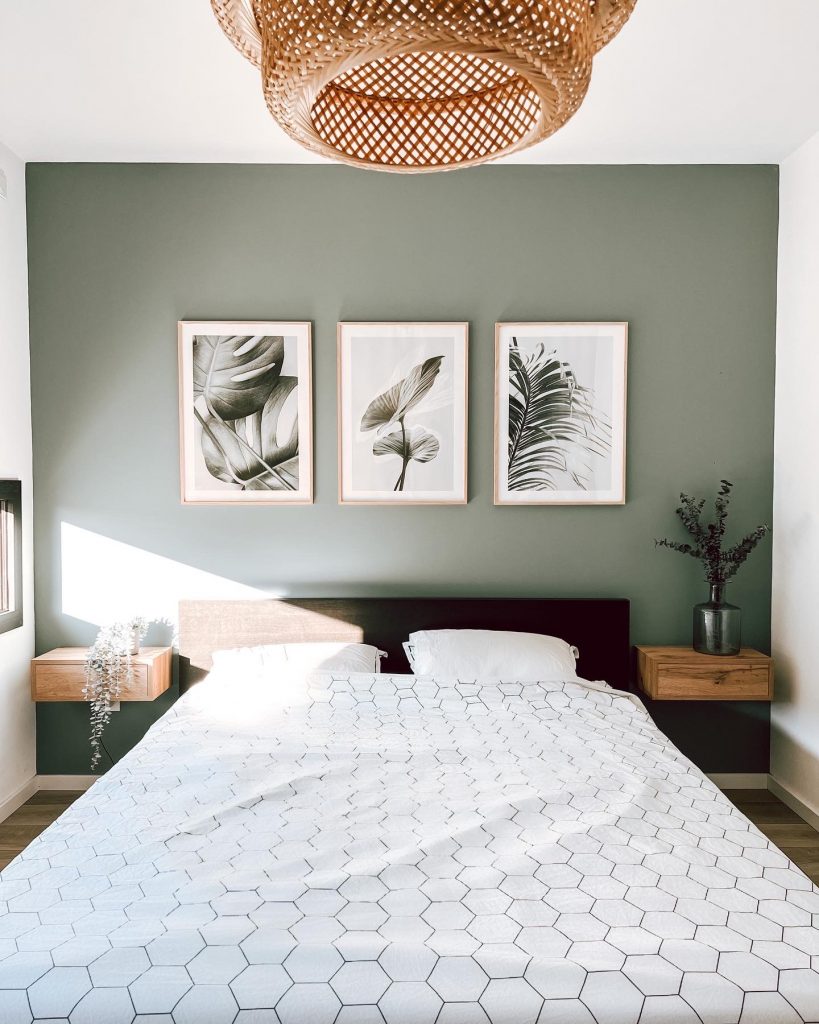
Green and sage work in a similar way: they evoke natural elements and tend to reduce the feeling of alertness that certain overly white or oversaturated environments amplify.
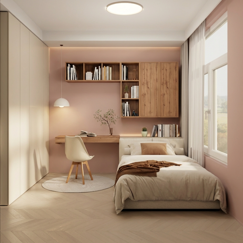
Beige and powder pink, on the other hand, create a sense of warmth and protection.
Colours to avoid in the bedroom are highly saturated ones such as red, orange, bright yellow: they can work as accents in small doses, less so on an entire wall or on large pieces of furniture. The same applies to very cold and bright whites, which at night under artificial light tend to appear harsh and not conducive to rest.
How to choose the colour for bedroom walls
the dimensions of the room, l’esposizione alla luce e lo stile dei mobili Neutral tones such as cream, sand, and taupe
Neutral tones such as cream, sand, and taupe work well because they leave room for manoeuvre on everything else. A neutral wall allows you to change textiles, add a new piece of furniture, or alter the lighting without having to repaint. White and light grey visually enlarge the space and are particularly useful in small or poorly lit rooms.
For rooms with a lot of direct light, cool and lightly saturated tones work well: dusty blue, sage green, sky blue balance the warmth without cooling excessively during quieter light hours.
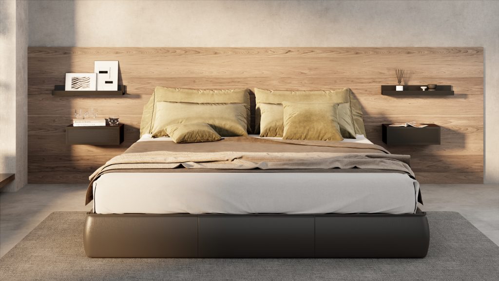
Warm tones such as terracotta, amber beige, and powder pink tend to create a more intimate and cosy atmosphere; they suit rooms that are less exposed to sunlight and pair naturally with light and medium-toned woods.
How to choose the colours of bedroom furniture
When choosing furniture, the wood finish above all makes the difference in creating harmony in the bedroom:
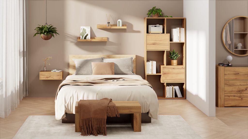
- Light Oak is the most adaptable finish. It pairs with almost any colour you might choose for the walls: pearl grey, sage green, warm white, beige, and even some blues.
- Il walnut, on the other hand, is already a warm wood with pronounced grain, and it calls for more restrained walls, such as a slightly desaturated greige that does not compete visually with the wood itself.
- Lacquered white or ashwood white furniture allows bolder colours on the wall, creating an original contrast that adds style and personality to the space

A chest of drawers and two matching bedside tables are often the core from which everything else stems: they define the dominant finish and immediately reveal whether the room is leaning towards something warm or cool. A desk in the same material, or in a complementary finish, brings cohesion without making everything too uniform. Bedroom benches, often overlooked, are an excellent place to introduce a colour accent through upholstery or cushions, without touching the walls. Wall units work best when they remain within the same colour family as the main furniture: that is where you can tell whether a palette has truly come together or whether something has been added without much thought.
The Fiver furniture range covers all these elements, from bedside tables to wall units, with finishes designed specifically to work together. Discover our full range of bedroom furniture and get inspired.
How to coordinate walls, furniture, and textiles without losing colour cohesion
For a bedroom, it usually suffices to choose three key colours: a dominant one for the walls, a secondary one for the furniture or floor, and an accent for cushions, lamps, and small objects.
Undertones, for example, matter more than one might think. If the walls have a cool undertone, say a grey with a bluish tint, and the furniture has a warm undertone, a golden wood for example, you perceive a kind of discord. Keeping undertones aligned, or managing the contrast skilfully, makes all the difference in creating a harmonious bedroom.
Some practical advice
One of the most common mistakes is choosing too many different colours thinking that more variety means more personality. The opposite usually happens: a neutral base with a well-chosen accent has more character than a room that tries to say too many things at once.
The warmth of the light affects the final result. Warm light enhances wood tones and softens cool shades, while very cold white light tends to dull colours and make the environment feel clinical.
Experiment with samples, observe how they change with the light at different times of day, and trust what you feel when you are in that room: the colours that work best are the ones that make you want to stay.