
Hanging a picture seems straightforward. Yet, faced with a blank wall, most people freeze. Where exactly should it go? How high? How do you mix different pictures together? Let’s remove the guesswork by establishing solid rules, clear decision criteria and useful guidelines to keep in mind for a harmonious, well-ordered picture arrangement.
The Role of Furniture in Wall Compositions
Furniture acts as a visual anchor for pictures. Ignoring it is the most common mistake: a picture is hung in isolation, with no connection to what’s below, and the result looks as though it’s floating in mid-air.
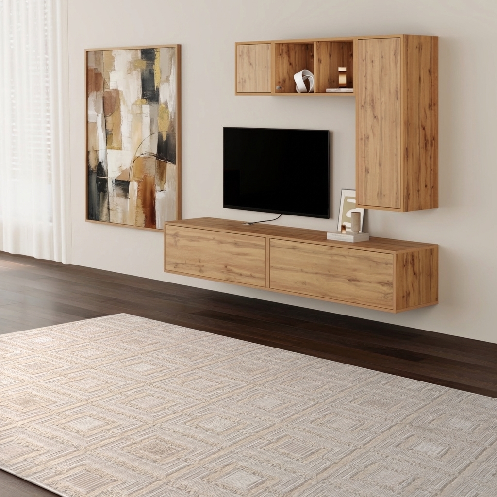
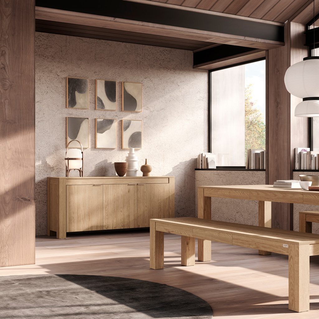
A wall-mounted TV unit already creates a strong horizontal structure. Pairing it with one or two portrait-format pictures on either side balances the composition without overloading it: above the screen they would compete with it. Sideboards, on the other hand, lend themselves to becoming the base of a contained gallery wall: three or five pictures arranged above with uniform gaps of 5–8 cm create a considered composition that never feels rigid.
The piece of furniture below acts as a visual base that anchors the composition to the room. When the proportions are right, the eye perceives a natural continuity between the different elements, and the entire wall gains stability and coherence.
How to Plan a Balanced Picture Composition
Arranging pictures is not simply about deciding where to hang each element — it’s about planning a composition that works as a coherent whole. The most effective way to achieve a harmonious result is to imagine an invisible geometric shape (a rectangle, a square or a horizontal line) within which all the pictures should sit. Even when the arrangement is free or asymmetrical, this hidden structure maintains order and visual intentionality.
Always Start with the Main Picture
If you have several pictures, identify the largest or most important one and use it as your starting point. This element becomes the visual centre of the composition. Position it first, then build everything else around it, adding the other pictures at a regular distance. Working in this order prevents the arrangement from looking haphazard and helps to maintain a balance between filled and empty spaces.
Grid Arrangement: The Tidiest Solution
A grid arrangement features pictures aligned both horizontally and vertically, with identical gaps between each one. It is particularly effective in modern or minimalist living rooms and with smaller-format pictures, because it conveys a sense of order and precision. It works well with pictures of the same format, but can be adapted to different sizes, as long as the edges follow clear alignments.
Free Arrangement: Dynamic but Controlled
A free composition uses pictures of different sizes in an apparently spontaneous way. The secret is to maintain a recognisable overall shape, avoiding any single element looking too isolated whilst filling the space visually. Here too, imagining an invisible perimeter helps to create a balanced arrangement that is pleasing to the eye.
How to Arrange Pictures on a Living Room Wall: The Rules That Work
At What Height Should You Hang Pictures?
The centre of the picture should be positioned at average eye level: between 150 and 160 cm from the floor. This is the rule used by museums because it allows you to look at the work without raising or lowering your head. The exception is pictures hung above a piece of furniture: in that case, leave 15–20 cm between the lower edge of the artwork and the surface of the furniture — enough to create breathing room without the two elements looking disconnected.
Above the Sofa: Proportions First
The wall above the sofa is the most visible in the living room. The composition should not exceed two thirds of the sofa’s width: too small and it gets lost; too large and it overwhelms. With a three-seater sofa, arranging three identical pictures in a horizontal row is always a reliable choice. For a more dynamic effect, try an asymmetrical arrangement with different formats, keeping an imaginary axis that holds the group together.
How to Hang Pictures Without Nails
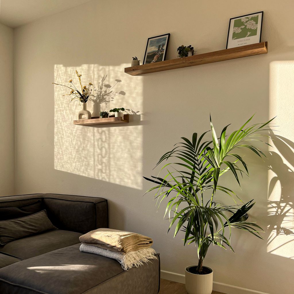
There is, however, a third option that is often overlooked: simply resting them. A wall shelf allows you to position pictures without a single nail, simply leaning them at a slight angle against the wall. The practical advantage is obvious, but there is also an aesthetic benefit: you can swap, rotate or add a piece in a matter of seconds. A long shelf thus becomes a living composition, capable of holding pictures of different formats mixed with decorative objects, books or small plants.
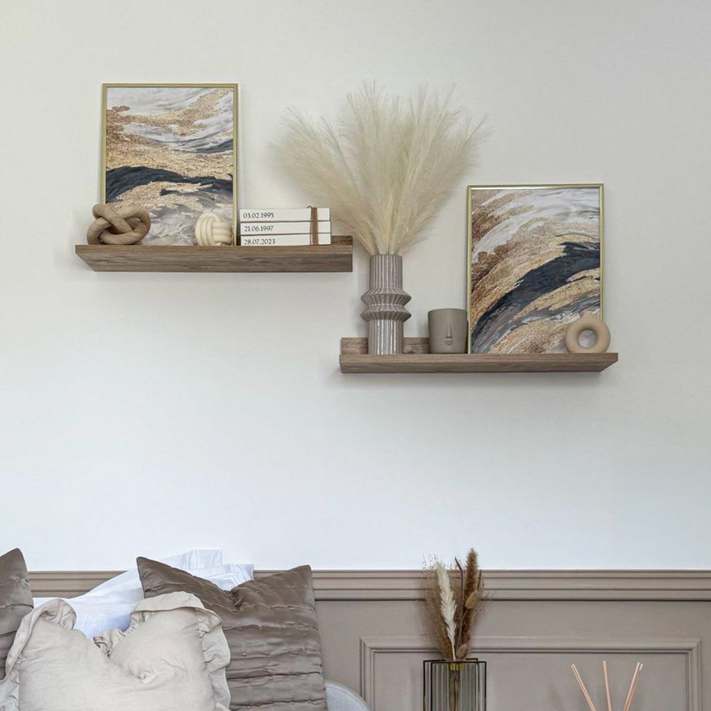
There is, however, a third option that is often overlooked: simply resting them. A wall shelf allows you to position pictures without a single nail, simply leaning them at a slight angle against the wall. The practical advantage is obvious, but there is also an aesthetic benefit: you can swap, rotate or add a piece in a matter of seconds. A long shelf thus becomes a living composition, capable of holding pictures of different formats mixed with decorative objects, books or small plants.
Picking up one or more colours already present in the living room — in fabrics, furniture or decorative objects — helps to integrate pictures naturally. Everything does not need to be perfectly co-ordinated, but the presence of colour echoes creates a visual continuity that makes the space feel more harmonious. Contrast can also be effective, particularly when you want to turn a picture into a focal point that immediately draws the eye.